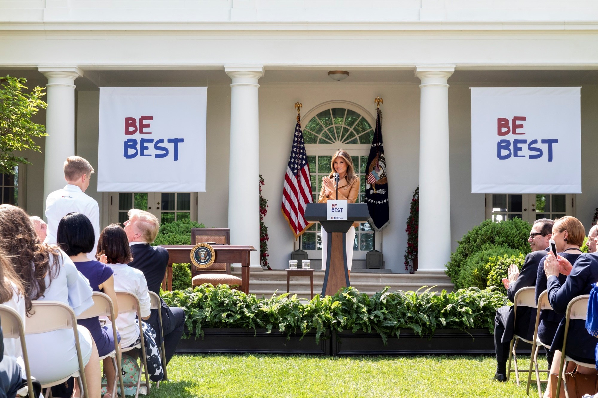
Okay, so I know I’m a bit behind on this one, but it sorta made my brain go sideways like a confused puppy and I needed a while to process it. And, as we all know, it takes a good long while (maybe about 16 months or so) to determine how to Be Best, so I figure I’m in good company.
“Be best” sounds like an entire campaign based on an autocorrect error
— Aparna Nancherla (@aparnapkin) May 7, 2018
Be Best is the name of the First Lady’s new child-focused initiative, focusing on three pillars: well being, social media use, and… opioid abuse? Okay. Are these things we’re for, against, or advising moderation in using? Or one of each? We want a strong pillar of well-being, yes! But perhaps the “social media use” pillar could be smaller, children shouldn’t be glued to screens all day, right? And actually, we don’t want to have a pillar for opioid abuse at all, maybe don’t have that pillar stand up at all. Hm.
Consistency is key in good communication.

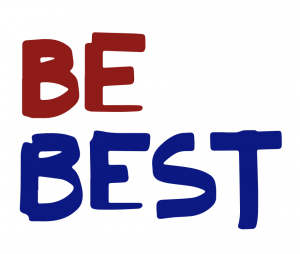
Be Best Letters
I know I just mentioned consistency, but kudos to the Be Best team for making the Bs and Es slightly different, since that’s important for an authentic look in a logo that’s meant to look hand-drawn. What’s up with the weirdly thin lines for the bottom of the Es, though? They look upside-down or something. And “BF BFST” is even further from an actual word-using phrase than it claims on the tin. At a distance (or, say, on the rumpled tshirts of 40 third-graders in a group photo), the Es really do look like Fs – that lower line just gets lost because your eye is looking for similarly-weighted lines akin to the rest of the letters.
Melania Trump designed the “Be Best” logo herself, an East Wing official told us. She likes clean lines, the official said, & wanted something that would appeal to children pic.twitter.com/6lABdOjkHp
— Julie Davis (@juliehdavis) May 7, 2018
…wait, what? “She likes clean lines”? Am I missing something about what makes these lines “clean”? On MY planet, “clean lines” means straight lines, smooth curves, sleekness, streamlined simplification. “Child’s refrigerator art” is generally not going to be referred to as having “clean lines”… pretty much ever.
Also, why is that T some sort of weird, extra-tall drop-cap at the end of a word? It trails off in an odd backwards curve that looks like someone just… gave up. It reminds me somewhat sadly of the carving in Monty Python’s Holy Grail where the intrepid knights debate the last words of Joseph of Arimethea as carved into a cave wall.
Look, if he was dying, he wouldn’t bother to carve ‘Aaaaarrrgh’. He’d just say it!
However, perhaps the T is biggest (best?) for a Very Good Reason. All good design decisions should have Reasons. But if you’re thinking what I’m thinking, Pinky, that T would be covered in gold leaf.

Be Best Colors
Red and blue, fine choices for a government initiative. Not particularly creative, but appropriate. Patriotic. On-theme. Well done there.
Kinda dark for kids, though.
Be Best Designer
It’s said that the First Lady designed this… logo… herself. Good for her. I welcome anyone to try new things! And it’s a children-oriented initiative, which some might assume would Be Best seen as represented by childlike lettering. So, open Photoshop, select a nice, wide, marker-type brush, and go to town with your non-dominant hand. Easy peasy kid-logo!
All the same, as Melania (or whoever) continues with her design education, I hope she will come to realize just how clichéd it is to use childish scribble-letters to represent children. It’s just… overdone. Unoriginal. Not just that, it’s insulting to the “children” who are old enough to not write that way. When you were eleven, did YOU want anything representing you to consist of multicolored crayon letters with backwards Es, just because it was “fun” and you were a kid? I’m gonna say probably not.
Be Best Copywriter
https://twitter.com/imillhiser/status/993573846379909123
I’m not one of those people who’s gonna pretend that the First Lady is somehow supposed to write all her speeches and press releases and letters and everything herself. I do, however, expect that she has staff that will at least come up with original content to give her.
Once again, that didn’t happen.
The pamphlet and the flyer design that accompanies the Be Best campaign is, with some small changes, a near copy of a 2014 document published by the Federal Trade Commission. (click into the Twitter threads to look at some details.)
https://twitter.com/MelsLien/status/993598037758005252
lmao… the White House/Melania Trump Be Best pamphlet about your kids being online is almost the exact same thing that the FTC published in Jan. 2014:
2014: https://t.co/s14hU9e6Cc
2018: https://t.co/dNas3LM8UP pic.twitter.com/WJTobZAPC1
— Ryan Mac 🙃 (@RMac18) May 7, 2018
While the initiative may have been a good one that was intended to continue beyond the Obama White House, why not just say so? What’s up with continuing the ruse that every damn thing that has come out of 1600 Pennsylvania Avenue since January 2017 is a new and glowing original concept, unsullied by Democratic hands? Why did the Be Best website originally claim that the pamphlet was “by” Melania Trump?
Seriously, what’s the point?
It’s not like this hasn’t happened before, with similarly negative effects. Her 2016 convention speech saw her roasted for lifting a section straight out of Michelle Obama’s 2008 convention speech. Time magazine also noted that “Be Best” sounds “a little too much like Michelle Obama’s “Be Better” answer to Oprah Winfrey’s question at the White House Summit on the United State of Women in 2016.” It’s two words, but… okay.
https://twitter.com/theyearofelan/status/993576188370137088
Poor Melania was welcomed home from the hospital on Saturday by her husband misspelling her name on Twitter, so perhaps I should cut her more than a little slack. I may know more about design, but I know she certainly speaks more languages than I do!
Be Best, Melania. Whatever it is you choose to do, Be Best.


It seems a perfectly clear and cromulant logo and program to me. It means “be the most beb”, as in BEB, BEBER, BEBEST. Maybe they can get Justin Beber to do the PSAs? The kids are into him, right? Oh, and kids, watch out for that Myspace!