Brochure/Poster/Hat – The Challengening
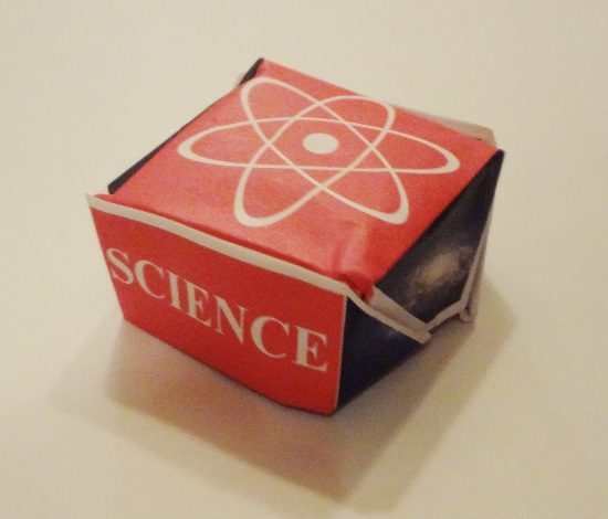
A while ago, I did that whole brochure/poster/hat thing. I tweeted about it recently, suggesting that maybe ScienceOnline might print some up. @marynmck replied, challenging me to make one in the form of a printer’s hat.
…as a former newspaper journo, i challenge you to do a printer’s hat 🙂 like this: http://t.co/n9HvSiab #scio13
Challenge accepted!
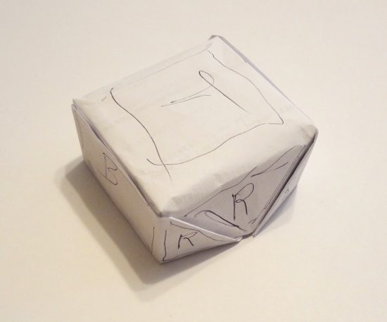
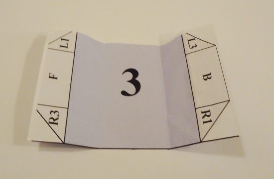
A printer’s hat, it turns out, is pretty much a box-shaped hat. I folded one up and marked the exposed areas…
…then made up a template. The gray areas represent the hat graphics; the blue areas are the brochure. You end up with a cover, inner flap and a trifold spread for the brochure. The sides of the hat are split into three triangles each but the front, back and top are contiguous rectangles.
(click on image for high-res image)

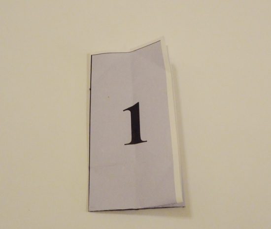
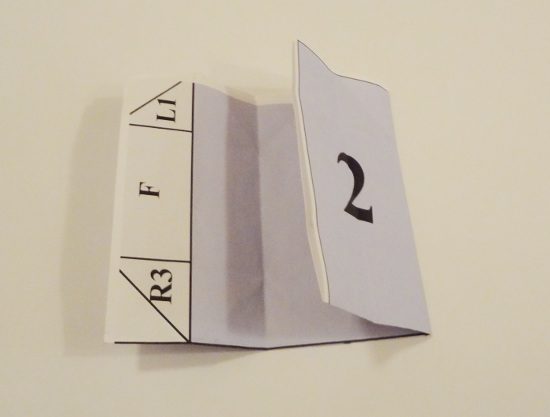
Here’s the template folded like a brochure.
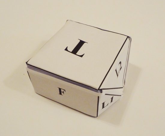
And here it is folder like a printer’s hat.
Like the previous design, the entire other side of the sheet can be used as a poster. The design should be printed on a 17″x22″ sheet. I used 8.5″x11″ for this but it should scale up OK. (Those sizes translate roughly to A2 and A4 metric paper sizes.)
Just for fun, I did a rough mockup of a design for a hypothetical science event.
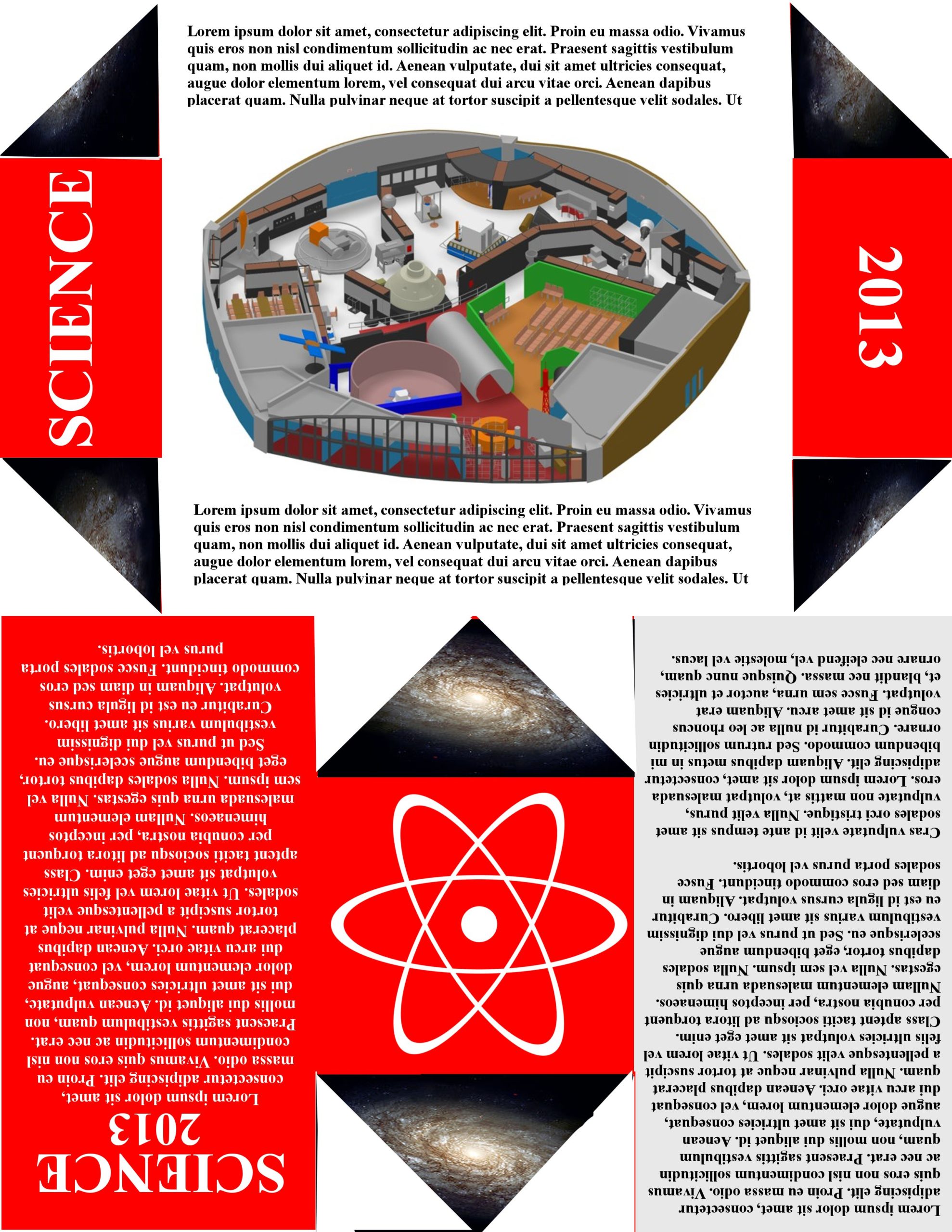
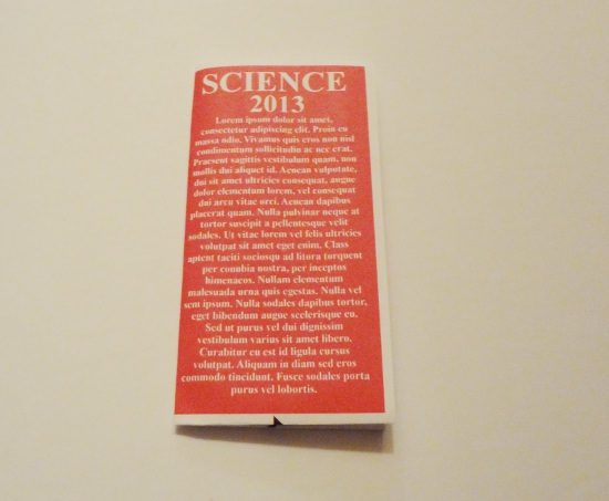
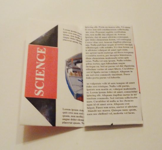
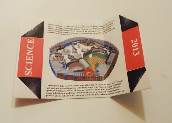
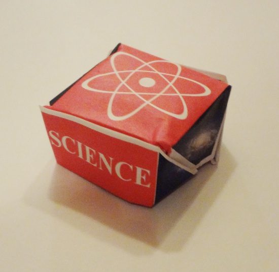
I did say it was a rough mockup. 🙂
Update: I made a full-scale one by taping 4 sheets together. Classy.

And here’s a quick video of the transformations:

Oh, now I need to make this one, too.
Are you going to Science Online 2013? Karyn seemed quite interested in doing something like this. She could probably use some design help. 🙂