
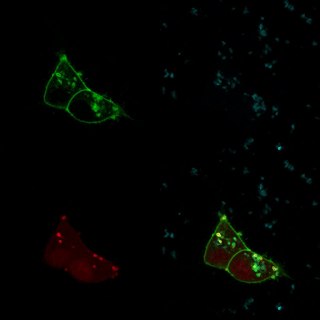
I’ve dedicated a couple posts to how we generate images of biologically relevant molecules. I’m going to zoom out significantly, and move from molecules all the way up to cells. Images like the featured image to the left are a mainstay of many biological studies. But, once again, there is a surprising amount of post-processing required to generate an image like that: the sample never looks like that as you’re gazing through a microscope.
The featured image was generated with a fluorescent microscope. So to explain how they’re generated, I have to start by explaining what fluorescence is, and how it works.
A fluorescent molecule is a molecule that, when hit with a photon of a certain wavelength, releases a photon of a different wavelength. This is different than luminescence – in which no initial photon is necessary – or reflection – in which the photon bounced back has the same wavelength. Green fluorescent protein (GFP), for instance, glows green under blue light.
In the featured image and the one below, the green comes from GFP, the blue comes from a DNA stain called DAPI which glows blue under UV light, and the red (in the featured image) comes from a protein called TdTomato, which glows red under green light. Each of those images is taken one-at-a-time, and they’re superimposed in post processing.

Why can’t we take all of the pictures at the same time, though? Well, these proteins aren’t perfectly efficient: they generally require somewhat more than the energy of one photon in order to release a photon. The number of photons emitted per photon absorbed is called the quantum yield, and most fluorescent proteins used in biological studies have a quantum yield between 50 and 70%. What’s more, when you illuminate a sample, most of the photons won’t even hit a fluorescent molecule – there’s just so much other stuff in the cell. So the signal emitted is MUCH dimmer than the illumination: if you took an image in all three channels at the same time, you wouldn’t see your signal over the illumination you had to add to get it.
We get around that by filtering the output along with the input. For GFP, we illuminate with blue light and we filter the output so we’re only looking at green light. That gives a picture like this one:

But that means that we couldn’t see DAPI or RFP fluorescence in this image, even if we were illuminating in the right wavelengths. And in fact, in order to illuminate in the right wavelength to get RFP fluorescence, we have to shine green light – which would swamp out the GFP fluorescence.

But wait, some enterprising scientist is saying right now. If RFP is excited by light that is the same wavelength GFP emits, doesn’t that mean that we could, say, shine blue light on a sample, which gets turned into green light by GFP, which leads to red fluorescence from RFP?
The short answer is not for this kind of image. The long answer is yes, but only if the GFP and RFP fluorophores are so close together that the VAST majority of green light emitted by GFP is in turn absorbed by RFP. If GFP and RFP are generally floating around in the same cell, this just doesn’t happen. But if you tether them both to the same molecule or complex, sometimes it does.
That’s a technique called fluorescence resonance energy transfer – FRET – in which we can test whether a GFP-tagged molecule and an RFP-tagged molecule are right next to each other (literally) based on whether we get green or red fluorescence after illumination with blue light. It’s very sensitive. If you tag two different molecules, FRET can tell you whether they bind to each other in a living cell. If you tag two parts of the same molecule (for instance, two domains of the same protein), you can see if they are right next to each other or on opposite sides of the molecule. One of the best parts is that most of these experiments can be done in living cells – so you can observe interactions that otherwise require harsh chemical techniques in living tissue.
So to get the featured image, we really have to take three images in three different channels. But this has two unexpected advantages. First, we can fine-tune those channels even more. Instead of just three fluorescent molecules, we can use five or six or more different colors. There are tons of fluorescent molecules to choose from, in blue, cyan, green, yellow, orange, red, far-red, and non-visible wavelengths. That means we can take pictures of three or four or six different things in the same cells. If we were taking one shot, it would be difficult to impossible to differentiate red and green fluorescence from yellow fluorescence. But since we measure them separately, that’s not a problem.
Second, even if we’re measuring red and green fluorescence, we don’t have to show that with the colors red and green. Which is convenient, since a good portion of people can’t tell red fluorescence from green fluorescence. An easy shift in post-processing can turn a red/green contrast to a blue/orange contrast, which makes it a lot easier for a lot of people to interpret.

When I read things like this I’m alway struck at just how damn smart people can be. For instance that FRET technique is really clever.
I also find myself looking at the pictures going ‘Oooh pretty!” when I’m suddenly smacked by the realisation that I’m looking at structures inside a cell. INSIDE. A. CELL.
I think we take these views a little too much for granted. Even three steps back from the bleeding edge of research we’re peering into things in ways that were unimaginable to our ancestors. I find a beauty in that ability that moves me over and above the physical attributes of the images upon the screen.
Thanks for the comment, coelecanth! I’m super impressed with FRET; it’s a great technique and a clever idea. And I totally agree with you on your last point; part of the reason I’m writing these posts is to help people understand the amount of work that goes into the images we use in biological research. It’s a whole different kind of work than taking a beautiful picture.